Today’s desk crit really helped me as far as what direction I should go in. My group and I are trying to capture the mill’s history as well as reflect what it will be used today. Essentially we want to connect the past to the present without being so literal. We decided to create a bridge within the space, which would connect you from one side to another but also one level to the next. In my first critique with Jimmy, it helped me to further develop our ideas. As far as if we are wanting to use the basement level to house shops/vendor areas we would need to think about the issue of flooding due to the Buffalo Creek. Would we create a roof system over our market area that will address the issue of water? Will we think of a way of creating a system that will collect the water that would runoff into the Creek when it rains? Also would our stores be permanent or moveable? In terms of lighting would there be a substantial amount of natural and artificial lighting. The direction I took as far as using the ironwork as an inspiration to connect the past to present is a great start. Jimmy also pointed me in the direction towards letting the fixtures be an aid in the connection.
In my second critique with Debbie I began to further my development and think about creating a staircase bridge, where there is this straight path that takes the shape of a bridge but different paths that maybe veer off into stairs or even a ramp or both. Through what my group and I have already produced it could potentially take on the notion of open/close. Relating Iron Mill work to modern plexi-glass that is eminent in the façade of the bridge itself.
Overall I have been inspired and encouraged to continue to think in a broad way. It is better to think large and then narrow it down then to think small and be stuck on what to do next. And to also continue to think abstract and draw, use sketch models, and use all types of medias to convey ideas.
Friday, September 26, 2008
Thursday, September 18, 2008
Market Research
An outlet mall also known as a outlet centre, is a type of shopping mall, in which manufacturers sell their products directly to the public through their own branded stores.


A shopping mall is a building or set of buildings that contain a variety of retail units, with interconnecting walkways enabling visitors to easily walk from unit to unit.
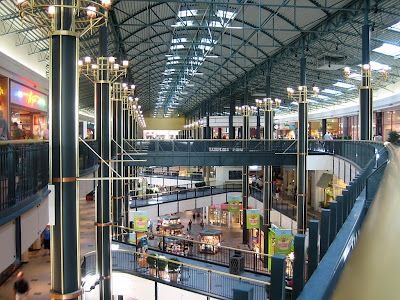
Mall of America


Mall in Tel Aviv
A bazaar is a shop where a variety of goods are sold. It is a permanent merchandising area, or street of shops where goods and services are sold or exchanged (wikipedia.org).

The Grand Bazaar of Istanbul

The Old Bazaar at Cairo

Plaza is a Spanish word related to the word “field” which in turn describes an open urban public space (wikipedia.org). The first shopping center built in 1922 was named “Country Club Plaza”, which adopted Spanish architecture. It is similar to a shopping mall, but described as a shopping complex.

This is A Civic Plaza in Albuquerque.

This a Main Street in Tijuana
According to wikipedia.org Main Street is the generic name of the primary retail street of a village, town or small city in many parts of the world. It is used as a reference to retailing. Main Street refers to a place of traditional values.
Main Street is not set up like a traditional mall. The philosophy behind it is about preserving the historic buildings within the surrounding environment. The focus is towards revitalizing. Looking at the pictures I found of a Main Street I see this shopping around being located at the heart of a small town.


Tuesday, September 16, 2008
REVOLUTION MILLS STUDIO
Revolution Mills is a part of the textile industry. It makes up a part of the Cones Mill Complex. Cone Mills was created in an effort to the dire need of a selling point that would compete with the mills of the north. Two brothers Moses and Ceasar Cone realized this need. Revolution Mills began as a flannel factory in 1898. It started as “Revelation” due to the fact that flannel was not a textile produced in the southern region and it was considered very innovated. Because of the biblical connotation that the word “Revelation” had it is said that they than chose to name it Revolution Mills. (revolutionmillstudios.com) Revolution Mills created a sense of change for Greensboro and the south as a whole. It was the first modern flannel mill in the Southern Region of the U.S.
Upon reading this information I never knew that there was a strong historical aspect behind the mills studio. Revolution Mills started as “the change” and once it switched over into Revolution Studios it signified a “revival”. This revival occurred in 2003 when Revolution Studios, LLC, bought it. In searching through the website I was amazed at the high level of work they create. As well as the strong connection they have within the community, from having socials for “tenants” to even having a walking club. I was amazed that there were so many businesses housed in this place. I looked at all the websites they had on there some were pretty interesting as far as what they stood for which is in relation to Revolution Mills overall tenant. I enjoyed looking at Abigail Seymour’s website (www.abigailseymour.com), she is a photographer. Abigail Seymour Photography is a photography business that houses other photographers each specializing in their own areas and having their own portfolio visible for people to see. I really loved the photos of the last post entitled Melinda & Ben. The angles of the photos that were taken were just phenomenal to me. They really catch the emotions of the people; you can feel the happiness that Melinda feels. I also really liked that the photographers took a detailed stance in that some of the images are blurred, for example the up close image of the bride, Melinda, her veil and face is blurred but her dress is not so you can see the details on her dress. Overall I enjoyed looking at this particular website. I was able to see that each website/ business is different but their overall purpose is the same.
Upon reading this information I never knew that there was a strong historical aspect behind the mills studio. Revolution Mills started as “the change” and once it switched over into Revolution Studios it signified a “revival”. This revival occurred in 2003 when Revolution Studios, LLC, bought it. In searching through the website I was amazed at the high level of work they create. As well as the strong connection they have within the community, from having socials for “tenants” to even having a walking club. I was amazed that there were so many businesses housed in this place. I looked at all the websites they had on there some were pretty interesting as far as what they stood for which is in relation to Revolution Mills overall tenant. I enjoyed looking at Abigail Seymour’s website (www.abigailseymour.com), she is a photographer. Abigail Seymour Photography is a photography business that houses other photographers each specializing in their own areas and having their own portfolio visible for people to see. I really loved the photos of the last post entitled Melinda & Ben. The angles of the photos that were taken were just phenomenal to me. They really catch the emotions of the people; you can feel the happiness that Melinda feels. I also really liked that the photographers took a detailed stance in that some of the images are blurred, for example the up close image of the bride, Melinda, her veil and face is blurred but her dress is not so you can see the details on her dress. Overall I enjoyed looking at this particular website. I was able to see that each website/ business is different but their overall purpose is the same.
Tuesday, September 9, 2008
Dynamic Retail Design

This store was designed by Stuart Weitzman. It is very geometric, and i think it fits well with the product being sold in the store.

This is not your average ice cream shop. It is called PinkBerry's.
.jpg)
I thought this store was real interesting. It is a music store in Tokyo.


Perfume Mania
One of my goals for this assignment is to create a store atmosphere that will induce a feeling of awe, excitement, and intrigue; exotic, vibrant. Because perfume is very versatile. There are so many different fragrances out there to cater to every women. Also there are light perfumes and then there are those that are on the heavy side. Lighter perfumes also known as body mists and spritz are more for the spring/summer season. During the fall/ summer season is when the heavier fragrances are worn.

This is a Glass Pod created by Ross Simmons.

This particular bottle is one of my favorites. It is one of Whitfield's designs. It is definitely inspired by nature. This bottle is very delicate, it is not just a bottle its a sculpture; a art piece.

Created by Neil Duman

Handblown perfume bottles by Robbins Ranch.

This is entitled Gold Mosaic... a part of Isle of Wight.

This is Isle of Wight Studio Glass Perfume bottles.
Challenge Two : concept overdrive
After spending days figuring out my concept and finding a way to merge it with my product we are now switching concepts and products with other members of our class. So now my new concept is...precarious balance with the product being perfume.
So what exactly is precarious balance.
Precarious (according to freedictionary.com) is defined as:
1. dangerous; lacking in security or stability
2. subject to change or unknown conditions
3. uncertain or unwarranted
Thesaurus: Unstable, Uneasy
(According to Merriam- Webster)
1. Depending on the will or pleasure of another
2. Dependent on uncertain premises
3. A lack of security or stability that threatens with danger.
Balance (according to Merriam- Webster) is defined as:
1. means of judging or deciding
2. stability produced by even distribution of weight.
What is the definition of Perfume:
Perfume (according to Merriam Webster) is defined as:
1. the scent of something sweet- smelling
2. a substance that emits a pleasant odor; natural essence.
Sunday, September 7, 2008
Case Study: StoreFrontView
The objective in design behind retail storefronts is too ultimately draw customers into the store. It also helps in creating a strong brand for the retail company. Stores try to go for something that is eye-catching and sometimes things that are thought provoking to put in the window to stop those walking past. In a matter of seconds a store display should grab ones attention when walking. It has to be appealing. Not only is what is placed in the window important but lighting also plays a major part in an effective window display. It is a good marketing strategy to have because light if used correctly will place emphasis on the display causing people who walk past to stop and look at the merchandise. Window displays gives the store a sense of identity as well as advertisement. It is the first impression a customer has of the store itself. It will determine whether or not a customer will go in the store or not. Window displays allow for the merchandise to be a focal point.

Chico’s is a store that sells sophisticated, casual to dressy clothing that targets women ranging from early 30’s to late 50’s. Even the mannequins look older targeting for the older demographic. What really drew me to their window display was this specific window, which has a large ad of a woman in a heavily designed pair of jeans, and on the glass pane it says A Jean Come True, which is an important part of their marketing strategy. Because a lot of times women who fit their specific demographic at those ages sometimes have a hard time finding that perfect pair of jeans…honestly I thin a lot of women all ages have that problem but maybe not as much. It was a good marketing tool. It made me interested to see if those jeans are really what they say they are.

This is a display from Soma Intimates, which is a part of Chico’s. Within this display alone I can see that these intimate apparel fit women of all shapes and sizes. Which is a good factor to know because there are 80% of women who are wearing the wrong bra size. With this particular store they say it only takes 10 min. for you to get fitted for a bra and find the perfect one. They are available in sizes 32A and 42DDD. This display is very simple and gets its point across.


With a store like White House Black Market having such a well-known name for it, it really doesn’t need much of a dramatic eye-catcher of a display. It is such a popular store to many that by word of mouth it is seen as a good store to shop in. Especially when celebrities wear clothing from the store it creates a brand and a name for itself. For example when Michelle Obama went on The View and said she had gotten the dress from White Black Market. The dress became very popular. The display of this particular one is very simple yet versatile.

Is a very unique store. It is powered by wind energy. Just from the name itself I get a feeling of the outdoors and nature. It makes use of two natural materials stone and wood. The display shows an effort towards invoking a feeling of preparation for the fall. It is simple in that it is an attention grabber in a subtle way where the entrance to the store will further your desire in wanting to take a look inside the store.


REI is a store for the needs of outdoor adventure. From a distance you can see the front structure protruding from the front façade of the store. When you see it you know that it is REI. This store is successful in creating a recognizable brand for itself as well as portraying the theme throughout. I really liked the door handles. It made me think that there was careful consideration of how everything would work to imply the theme.


J. Crew is very clear-cut and straight to the point. There is evidence suggesting that there is minimal license for creativity within the display. It is a clear view of the clothes itself not having a background that would be a distraction. It is a “blank canvas”. I didn’t feel that the ripped piece of paper revealing merchandise behind it that is “breaking through”, was effective enough. Maybe if the rip was a little cleaner and seemed more deliberate

Ann Taylor is another store similar to Chicos. I was actually a little disappointed by their display. It didn’t seem very interesting to me. The clothes were cute but the display was too plain. And one of the hanging boxes was crooked.

Swoozie’s is a very fun store. The choice in signage definitely goes with the stores uniqueness. The choice in color gives a playful, fun mood. They are very eco- friendly as well. They now offer paper that is 100% recycled 30% post- consumer waste. Their entertainment ware is from recycled material.

I really liked the signage and the door design. It made me really think of cooking. Especially seeing the Sign on the door about the Emeril cooking utensils made me want to go in…but of course it was clos
Anthropologie
Anthropologie....
Is the most amazing store. Their clothing is unique, the home objects are timeless. Its like stepping into a treasure chest. I really believe this trip helped me further my exploration in the new concept and product i now have. Anthropologie truly is different than most retail stores they pretty much have the license and freedom to do whatever they please as far as layout and branding to an extent. The front display was very appealing and unique. he biggest thing that stuck out to me about the store is that they are big on using simple everyday things and creating something extraordinary.


Is the most amazing store. Their clothing is unique, the home objects are timeless. Its like stepping into a treasure chest. I really believe this trip helped me further my exploration in the new concept and product i now have. Anthropologie truly is different than most retail stores they pretty much have the license and freedom to do whatever they please as far as layout and branding to an extent. The front display was very appealing and unique. he biggest thing that stuck out to me about the store is that they are big on using simple everyday things and creating something extraordinary.


MODERN RUINS
For this assignment we were each given a concept and a product. Our clients were Four Season mall execs who are wanting to change the image of the current mall. My concept was "Modern Ruins" and my product were "pets". These are definitely two different categories in itself.
So i began by defining my concept. When I think of Modern Ruins the words: decaying, destruction, abandoned, aging, timeless, and so forth. Then two phrases came to mind. Beauty is in the eye of the beholder and "out of destruction comes life". And I thought this is it. This ties my concept and my product together.
I then began a search of images that would help me figure out what my composite 3d image would be.


Subscribe to:
Posts (Atom)