Friday, November 21, 2008
Conceptual Perspectives
Paying great detail to how dresses fold and curves I let that help me design how i want my clothing showcased within the space. Using the painting
Jeune fille en vert, 1930 by: Tamara de Lempicka as a precedent study.


Jeune fille en vert, 1930 by: Tamara de Lempicka as a precedent study.


Floor Plan
I decided to look through my inspiration to figure out my floor plan/ layout design. Wanting to carefully design it in detail so that it would follow a continuous series.


Wednesday, November 19, 2008
Finally A Concept.....
From this point on I decided to once again talk to my fellow classmates as to what direction i should go in. This helped me so much. After talking to Jackie and explaining to her what i have thus far she used the word "Continuum." That word went off in my head like a light bulb. That is what my concept is and it was in front of me all this time in my sketches and inspiration photos but i just did not see it.
Continuum-(according to Merriam Webster) is defined as a coherent whole characterized as a collection, sequence. or progression of values.
According to MSN Encarta Encuclopedia: A continuous seamless series: a link between two
things, or a continuous series of things.
For the purposes of this project the ink is between the past and the present.
From here I also was able to narrow down the era in which my vintage formal dresses would come from; 1920s to 1940 the Art Deco Period. Also using the details and curvature of fabric to figure out a layout design.


Concept Journey..Take Two
So...I still don't have a concept as of the 14th. Still searching and trying to sort out my ideas.
After talking to Suzanne we both looked at everything i had compiled up to this point and came up with words that described what i wanted:
I saw this space as a: Coming to life experience
Using the element of suspension
A fading of color
Breaking the mold
Preserving the past and going forward into the future.

This ended up being a fixture that i wanted to make that played off of the element of suspension.

....NO CONCEPT....I'm stuck...
After exploring with perspectives I came to the realization that i do not have a concept....
So in order to figure out my concept i decided to write down the words that come to mind when i think of vintage clothing.

Based on the inspiration images i created earlier I decided to make my color palette: red, black, blue, and a mixed color (pink,blue..)
The words that really stuck out to me were: Delicacy, Divine, "Made just for me" and impulse.
From there i decided to research impulsion.

Working With Perspectives
On to designing the interior of my store. These are explorations with perspective views of how i see the space. Having a bit of conflict figuring out how to push the merchandise off the walls of the space.

The goal in these perspectives were to really figure the overall mood i would like to convey when a customer walks into the space.

In this next perspective i thought of breaking up the "boxy" feel of the space by creating curved walls creating a different effect of the space. Also elevating the mannequins on what could be considered a stage. Each one strategically spaced in an equal distance from each other and in a different color. The colors on the dress would fade off the mannequin down to the floor leading you to specific designate areas within the space that are color coordinated.
Tuesday, November 18, 2008
Process Work: Phase 2...Vintage...
What is Vintage?
When I think of vintage the words that come to mind are:
Archetypal
Old-Fashioned
Traditional
Antiquated
When I think of fabric of dresses I think of:
Draping
Ribboning
Weaving
Banding...Banding continues to stick in my head.
From this point on I came to the conclusion that I want to create a different way to display the vintage dresses. Because I believe that these dresses are too beautiful and delicate to be merely hung up against the wall. Debbie showed me images from a book she had that started me on my way to creating dresses that are hung away from the wall.
Dress Code: interior design for fashion shops/[compiled by Tessa Blokland]. Amsterdam:Frame Publishers; Basel: Birkhauser-Publishers for Architecture, c2006.

Wednesday, November 12, 2008
Process Work: Phase 1...continued


I then decided to come up with more images that would ultimately guide me along my design process.
From these sets of images I found my color palette of the vintage formal dresses that i would showcase in my store.
Process Work Phase: 1.5

From this point we were given the assignment to come up with inspirational images to help us along the way.
I call this my Vintage Inspiration.
Process Work: Phase 1

After getting feedback from Ashley Warriner, I realized that in fact I did have two separate ideas of what i would like my store to be.
One idea being the boutique/museum fell where the dresses themselves serve as the color within the space. Showcasing the dresses themselves.
The other was the "backstage at a fashion show", where there is loud music, splash of color, a frenzy trying to find the perfect dress in the right size.
I liked both ideas and have been torn between the two.
Friday, October 31, 2008
Vintage....Vintage....and more Vintage
My retail space will sell vintage formal dresses from all eras. These dresses are high end and can be considered couture depending on the time period it is from. My store is located in one of the glass cubes that have 2 levels. I have considered playing with level heights being that the space I have is so vast. I am also considering making a display room that would make the space more intimate. I would really like to keep the store in terms of color neutral either a stark white or black, most likely white. Keeping t he store in a sort of “blank palette” will really let the garments speak for themselves. A lot of the formal dresses I have been looking to place in my store are a variety of color. What tends to happen is when the word formal dress is thrown out there many tend to think of black and white because these neutrals are clean, classic and allows for one’s accessories to pop. But I wanted to move away from that I think other colors worn are fun but can also be classy as the black and white. I really want the dresses themselves to be somewhat like individual art pieces within the store, each creating an added element to the overall feel of the space. I have been working on creating a new way to hang my garments in the store, possibly a different material that serves as a rack other than wood, plastic, metal, etc.
After the feedback I received from last class I have considered separating my garments by color and play with lighting that will highlight each specific color. I once again could not help but think back to the trip to Anthropologies. The ways they design their stores are completely different than most retail stores. So in terms of a window display and floor set up I was thinking of using common everyday materials/products to create a dress or something to that effect. I am also considering making a different “room” with a specific color because again I would like to create a different mood from each garment piece.
So how does this all relate to Revolution Mills…well as an overall scheme of things I am taking the old and having an appreciation for it, combining the past and present and moving forward with the future. I am still striving for the sustainable factor behind my retail store, I do still see theses dresses being sustainable and being the original dresses of its kind. Using recyclable materials for display purposes. I am taking a new approach in interpreting vintage.
As a customer entering the store I want them to rally be able to experience a full spectrum of vintage formal fashion. Possibly make them feel they are in the dressing room behind stage of a fashion show and they get to choose whatever dress they want, try them on, and buy them; almost feeling like a model/ celebrity. But it is just a thought, I’m not really sure if that is what I really want.
Sunday, October 26, 2008
Case Study Three: precedents and the like

KIT24 is by Karim Rashid. It is a 24-sided house that also serves as a metaphor for time and is based on a 24-hour day. It’s a unique, colorful candy-coated space that is about 1800 square feet. I like its unique geometric shape and in my opinion a structure like that would be interesting to break up the space of the large glass cube space I have to work in. The color is also what appealed to me, which would definitely draw a variety of women of different ages into the store. The space I choose to put my retail store in is one of the glass cubes that have 2 levels within and I thought the staircase design that Karim Rashid constructed is very different and in an up-close view it sort of resembles and abstract letter v. A major part of the design that I like is the usage of recycled materials. The exterior is painted recycled aluminum panels.
Design Now!
By: Charlotte and Peter Fiell
p. 464

To me vintage clothing is exclusive and can be a work of art. Oscar Wilde once said, “One should either be a work of art, or wear a work of art”. Therefore the store itself should reflect that of an art piece similar to what Milanese architect Fabio Novembre created for the Stuart Weitzman store in Rome. There is a weaving created by ribbons that are across the walls and ceilings used to form shelving and seating. Essentially I would like to create something that is dynamic as this without taking the focus away from these unique designer dresses. Instead I would like the store design to enhance the merchandise, drawing customers in to shop.


In wanting to create such a unique store I couldn’t help but look back at Anthropologies being that I want to keep my store sustainable as possible. The Anthropologies we visited was very creative in its display from the window to the overall layout of the space. In terms of their layout design I really like the pinball game theory and may consider using that for my store. I also liked how the company as a whole uses conceptual ideas for the window displays as well as concept names for different areas within the store. As a possible window display, to kind of keep in tune with the sustainable aspect behind these vintage clothing is to make high end vintage dresses out of sustainable materials like newspaper, plastic, bubble wrap, etc. The biggest thing I took away from that experience that I would like to emphasize within my store is “using something very ordinary in a very extraordinary way.”
What Comes Around Goes Around


What Comes Around Goes Around is a store in New York City in SoHo village. It is a store that specializes as well as has a wide range of vintage clothes and accessories that date back to the Victorian time period. This store is exclusive and is a showroom that can only be viewed by appointment. From looking at these images I can tell that there is definitely a precise selection of the type of merchandise sold within. WCAGA has the largest collection of vintage jeans. When researching the store I learned some interesting points that I may want to consider in creating my vintage store: for one being able to discern good vintage from bad vintage, knowing how to find the good vintage, and what vintage pieces will sell to your trend- minded designer customers (courtesy of www.acontinuoslean.com). This is what I am designing my store to be, it will be a specific collection of original designs created by top fashion designers, which mean there is a limit in terms of size, and are not able to be replicated in design.

In terms of product display I would like to emphasize to the customer the trend in vintage dresses and one of the looks they could portray. To do this I would need to create an eye-catching display. In this image of an in-store display at Lane Crawford in Hong Kong there is a long vertical fixture that seems to run down the middle of the floor. On top of this fixture is a line of mannequins wearing a specific color placing distinct emphasis on a particular style within the merchandise of the store. Also having the recessed eyeball lighting in the ceiling helps to accentuate the mannequin display.
Visual Merchandising
by: Tony Morgan
p.156
Published in 2008

For my retail store I would like a sophisticated yet edgy look as well as mood for the space. Possibly going for a contemporary feel with little dressed fixtures being that these garments can be expensive. This perfume department in London has traditional floral wallpaper, a fireplace as well as simple yet delicate chandelier hanging over the centered seating area.
Visual Merchandising
by: Tony Morgan
p.123
Published in 2008
Wednesday, October 22, 2008
Individual Retail Environment Proposal
For this assignment I am proposing to create a Vintage Clothing store, that specialize in selling primarily vintage dresses. This type of retail environment is appropriate within the Revolution Mill space because it relates to the overall concept of our group The Shops at Buffalo Creek. Vintage follows behind the notion of connections, connecting from the past into the future, which in turn brings about change but also leaving remnants of the past visible within. According to wikipedia.org vintage clothing is defined as a new or second hand garment originating from a previous era. This definition could also be used to define Revolution Mills in the sense that The Shops at Buffalo Creek is the new that originates from the old.
In the group The Shops at Buffalo Creek we were all about reusing and salvaging the existing materials that are within Revolution Mills to keep costs low as well as be sustainable. If you think about it Vintage Clothing is also sustainable to the environment; essentially you are reusing, recycling and repairing old garments rather than throwing them away. There is a historical aspect that is still there in terms of an appreciation as well as awareness in the differences of designers then and now.
The store’s product appeals to women, specifically women where money is not an option, wanting to have a unique collection of clothing as well as the fashion-nostalgic woman. This store is unique to Greensboro because while there are thrift shops within the area there is not a vintage store, where it sells only dresses. Also the dresses range from everyday to high-end evening haute couture dresses at low prices.
A vintage store lends so many different creative display ideas. When I think of vintage I think of color, shapes, more specifically the artist Andy Warhol comes to mind. www.warhol.org


Friday, September 26, 2008
desk crit roulette
Today’s desk crit really helped me as far as what direction I should go in. My group and I are trying to capture the mill’s history as well as reflect what it will be used today. Essentially we want to connect the past to the present without being so literal. We decided to create a bridge within the space, which would connect you from one side to another but also one level to the next. In my first critique with Jimmy, it helped me to further develop our ideas. As far as if we are wanting to use the basement level to house shops/vendor areas we would need to think about the issue of flooding due to the Buffalo Creek. Would we create a roof system over our market area that will address the issue of water? Will we think of a way of creating a system that will collect the water that would runoff into the Creek when it rains? Also would our stores be permanent or moveable? In terms of lighting would there be a substantial amount of natural and artificial lighting. The direction I took as far as using the ironwork as an inspiration to connect the past to present is a great start. Jimmy also pointed me in the direction towards letting the fixtures be an aid in the connection.
In my second critique with Debbie I began to further my development and think about creating a staircase bridge, where there is this straight path that takes the shape of a bridge but different paths that maybe veer off into stairs or even a ramp or both. Through what my group and I have already produced it could potentially take on the notion of open/close. Relating Iron Mill work to modern plexi-glass that is eminent in the façade of the bridge itself.
Overall I have been inspired and encouraged to continue to think in a broad way. It is better to think large and then narrow it down then to think small and be stuck on what to do next. And to also continue to think abstract and draw, use sketch models, and use all types of medias to convey ideas.
Thursday, September 18, 2008
Market Research
An outlet mall also known as a outlet centre, is a type of shopping mall, in which manufacturers sell their products directly to the public through their own branded stores.


A shopping mall is a building or set of buildings that contain a variety of retail units, with interconnecting walkways enabling visitors to easily walk from unit to unit.
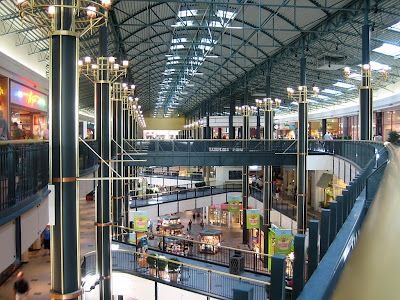
Mall of America


Mall in Tel Aviv
A bazaar is a shop where a variety of goods are sold. It is a permanent merchandising area, or street of shops where goods and services are sold or exchanged (wikipedia.org).

The Grand Bazaar of Istanbul

The Old Bazaar at Cairo

Plaza is a Spanish word related to the word “field” which in turn describes an open urban public space (wikipedia.org). The first shopping center built in 1922 was named “Country Club Plaza”, which adopted Spanish architecture. It is similar to a shopping mall, but described as a shopping complex.

This is A Civic Plaza in Albuquerque.

This a Main Street in Tijuana
According to wikipedia.org Main Street is the generic name of the primary retail street of a village, town or small city in many parts of the world. It is used as a reference to retailing. Main Street refers to a place of traditional values.
Main Street is not set up like a traditional mall. The philosophy behind it is about preserving the historic buildings within the surrounding environment. The focus is towards revitalizing. Looking at the pictures I found of a Main Street I see this shopping around being located at the heart of a small town.


Tuesday, September 16, 2008
REVOLUTION MILLS STUDIO
Revolution Mills is a part of the textile industry. It makes up a part of the Cones Mill Complex. Cone Mills was created in an effort to the dire need of a selling point that would compete with the mills of the north. Two brothers Moses and Ceasar Cone realized this need. Revolution Mills began as a flannel factory in 1898. It started as “Revelation” due to the fact that flannel was not a textile produced in the southern region and it was considered very innovated. Because of the biblical connotation that the word “Revelation” had it is said that they than chose to name it Revolution Mills. (revolutionmillstudios.com) Revolution Mills created a sense of change for Greensboro and the south as a whole. It was the first modern flannel mill in the Southern Region of the U.S.
Upon reading this information I never knew that there was a strong historical aspect behind the mills studio. Revolution Mills started as “the change” and once it switched over into Revolution Studios it signified a “revival”. This revival occurred in 2003 when Revolution Studios, LLC, bought it. In searching through the website I was amazed at the high level of work they create. As well as the strong connection they have within the community, from having socials for “tenants” to even having a walking club. I was amazed that there were so many businesses housed in this place. I looked at all the websites they had on there some were pretty interesting as far as what they stood for which is in relation to Revolution Mills overall tenant. I enjoyed looking at Abigail Seymour’s website (www.abigailseymour.com), she is a photographer. Abigail Seymour Photography is a photography business that houses other photographers each specializing in their own areas and having their own portfolio visible for people to see. I really loved the photos of the last post entitled Melinda & Ben. The angles of the photos that were taken were just phenomenal to me. They really catch the emotions of the people; you can feel the happiness that Melinda feels. I also really liked that the photographers took a detailed stance in that some of the images are blurred, for example the up close image of the bride, Melinda, her veil and face is blurred but her dress is not so you can see the details on her dress. Overall I enjoyed looking at this particular website. I was able to see that each website/ business is different but their overall purpose is the same.
Upon reading this information I never knew that there was a strong historical aspect behind the mills studio. Revolution Mills started as “the change” and once it switched over into Revolution Studios it signified a “revival”. This revival occurred in 2003 when Revolution Studios, LLC, bought it. In searching through the website I was amazed at the high level of work they create. As well as the strong connection they have within the community, from having socials for “tenants” to even having a walking club. I was amazed that there were so many businesses housed in this place. I looked at all the websites they had on there some were pretty interesting as far as what they stood for which is in relation to Revolution Mills overall tenant. I enjoyed looking at Abigail Seymour’s website (www.abigailseymour.com), she is a photographer. Abigail Seymour Photography is a photography business that houses other photographers each specializing in their own areas and having their own portfolio visible for people to see. I really loved the photos of the last post entitled Melinda & Ben. The angles of the photos that were taken were just phenomenal to me. They really catch the emotions of the people; you can feel the happiness that Melinda feels. I also really liked that the photographers took a detailed stance in that some of the images are blurred, for example the up close image of the bride, Melinda, her veil and face is blurred but her dress is not so you can see the details on her dress. Overall I enjoyed looking at this particular website. I was able to see that each website/ business is different but their overall purpose is the same.
Tuesday, September 9, 2008
Dynamic Retail Design

This store was designed by Stuart Weitzman. It is very geometric, and i think it fits well with the product being sold in the store.

This is not your average ice cream shop. It is called PinkBerry's.
.jpg)
I thought this store was real interesting. It is a music store in Tokyo.

Subscribe to:
Posts (Atom)